Your website may be getting traffic. But are those visitors contacting your admissions team?
Addiction treatment website design affects what happens after someone lands on your site. People need to understand your programs, trust your facility, and find a clear way to ask for help. When those steps are difficult, you can lose inquiries even when your marketing brings the right people to the page.
A useful website makes that process easier. Here is what to focus on.
The website examples below are from Brand House clients. Click an image to see it larger.
Tell Visitors What You Offer Right Away
Someone should understand what your treatment center does without scrolling through several sections. Start with your services, location, and who you help. Give visitors enough information to decide whether they should keep reading.
A headline like “Your Journey Starts Here” could describe almost any treatment center. It does little to explain your actual services.
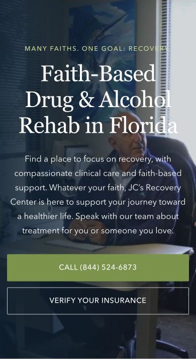
JC’s Recovery Center gets specific with “Faith-Based Drug & Alcohol Rehab in Florida.” The mobile hero tells visitors what the center offers and where it is. The supporting copy explains the approach before visitors choose whether to call or verify insurance.
The wording should match the care you provide. Follow it with a clear next step, such as “Speak With Admissions” or “Explore Our Programs.”
 View larger ↗
JC’s Recovery Center: The mobile hero names the treatment, approach, and location before offering call and insurance options.
Our team of experts is here to help you navigate the complex landscape and drive real results.
TALK TO AN EXPERT →Make Your Treatment Programs Easy to Find
People arrive with different levels of knowledge. Some know they need an intensive outpatient program. Others are trying to understand the available options.
Use familiar program names in your navigation. Give each distinct level of care its own page when there is enough useful information to explain it. Avoid putting every service into one long page that visitors have to search through.
Each program page should answer a few basic questions:
- What is this program?
- Who is it designed for?
- Where does treatment take place?
- What does the schedule involve?
- How does someone get started?
Explain clinical terms when you use them. Someone researching treatment for the first time should be able to follow the page without opening another website.
Make the differences between programs clear. If you offer both residential treatment and outpatient care, explain how they differ. If you do not provide detox, say so where that information helps visitors understand their options.
Build Trust With Specific Information
General statements about compassionate care only tell visitors so much. Give people information they can use to evaluate your center.
Show your actual facility. Introduce your clinical team. List current credentials and explain the services your team provides.
Useful trust information includes:
- Staff photos and biographies.
- Accurate licensing and accreditation details.
- Real photos of treatment spaces.
- Clear locations and contact information.
- A straightforward explanation of your approach to care.
Place relevant information near the questions it answers. A program page can introduce the team involved in that program. A location page can show the actual building and explain how to get there.
Show relevant credentials where people can find them. Badges such as LegitScript certification and Joint Commission accreditation should reflect your current status. Link to verification where possible.
 View larger ↗
JC’s Recovery Center: A compact badge row puts credentials close to the opening content.
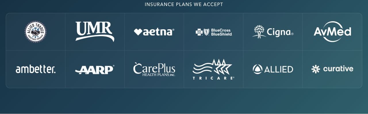
Insurance logos can also help people find useful information quickly. Keep the list accurate and explain that the team still needs to verify benefits. A logo alone does not confirm someone’s coverage.
 View larger ↗
JC’s Recovery Center: Insurance logos help visitors recognize their plan. Coverage still needs to be verified.
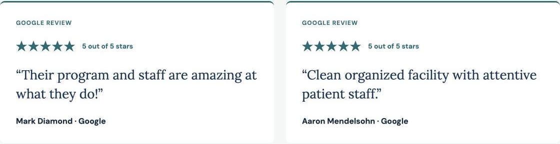
Testimonials give visitors another way to learn about the center. Keep the source clear and provide a way to read more. Only use reviews and stories you are permitted to share.
 View larger ↗
Emory Recovery Center: Short review cards show the source and give visitors a way to read more on Google.
Be careful with claims about results. Only publish outcomes you can support and explain. A polished website cannot make an unsupported promise more credible.
Make Every Button’s Next Step Clear
A button should tell someone what will happen when they click it. “Learn More” and “Get Started” can leave people guessing. Use wording that matches the action.
- Call Admissions: starts a phone call.
- Verify My Insurance: opens the insurance verification form.
- Request a Callback: opens a form to ask the team to call later.
The page after the click should match the button’s promise. If someone clicks “Verify My Insurance,” take them to that form. Do not send them to a general contact page and make them search for it.
For phone buttons, match the wording to the device. “Click to Call” works on mobile because the visitor can start a call from that device. On desktop, a phone link needs a calling app or another configured tool to work.
Avoid a desktop button that only says “Click to Call.” Display the actual phone number so visitors can read it and dial from their phone. Keep the number clickable for people who do have calling software. A label such as “Call Admissions: (555) 123-4567” explains the action and shows the number.
Offer another option for people who cannot call or prefer to write. A short callback form can work well here. Explain who will respond and what happens next.
Set accurate expectations about availability. Only advertise round-the-clock phone support if someone answers around the clock. If your team returns messages during business hours, explain that clearly.
Offer Insurance Verification and a General Contact Option
Your website should have a dedicated insurance verification form alongside a basic contact form. These serve different needs.
Someone providing insurance details is taking a more specific step toward treatment than someone sending a general question. Treat that as a higher-intent inquiry and give admissions a clear process for following up. Coverage and program fit still need to be confirmed.
 View larger ↗
JC’s Recovery Center: The coverage explanation leads into a clearly labeled insurance verification button.
Before the form, explain what information someone needs and what your team will do with it. Make clear that submitting insurance details does not guarantee coverage or admission.
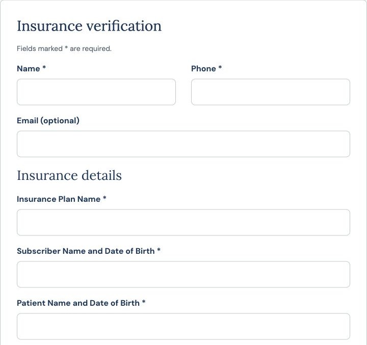
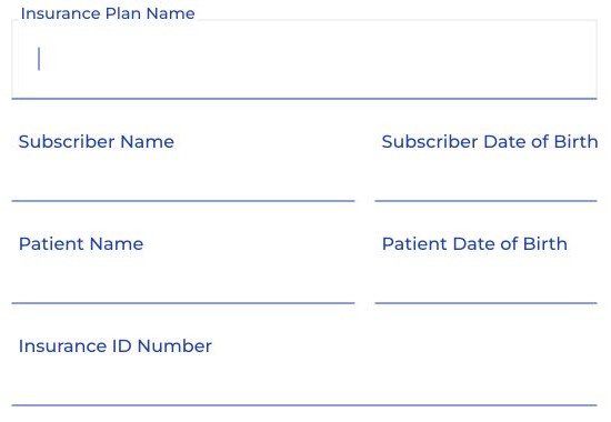
Group related fields so the form is easier to follow. Contact information can come first, followed by insurance details. If the patient and policyholder are different people, make it clear whose information goes in each field.
 View larger ↗
Emory Recovery Center: A heading separates contact information from insurance details.
 View larger ↗
Recovery Services of Connecticut: Separate patient and subscriber fields make it clearer whose details to enter.
Keep a visible option for people without insurance. A link or button labeled “I Don’t Have Insurance” can lead to information about available payment options or a conversation with admissions. People who are unsure about their coverage should also have a way to ask for help.
Give visitors three clear choices:
- Verify My Insurance: start the coverage verification process.
- I Don’t Have Insurance: ask about available payment options.
- I Have a Question: contact admissions without completing insurance verification.
A lack of insurance should not prevent someone from making an inquiry. Give them accurate information about the options your center can offer.
Place Calls to Action Where Questions Come Up
A call to action tells someone what to do next. It can be a call button, an insurance link, or an invitation to send a question.
Place it near the information that makes the action useful. After explaining insurance, offer verification. After explaining a program, give visitors a way to ask admissions about that program.
You can also repeat the next step near the end of the page. Someone who has read through the programs and admissions information should not have to scroll back to the top to contact you.
Keep the actions consistent. Use the same phone number and clear labels throughout the page. Repeating a useful contact option works best when it does not cover the content or interrupt reading.
Keep Forms Simple and Explain What Happens Next
A long form can make a basic question feel like an application. Match the form to the task.
A callback request may need much less information than insurance verification. Ask for what your team needs at that stage. Use clear field labels and helpful error messages.
Make sure visitors can tell whether their submission worked. A confirmation should explain what happens next and when they can expect a response. Only promise a response time your team can meet.
Have your privacy and compliance reviewers assess how these forms collect, send, and store information. Include tracking, chat, and connected systems in that review.
Design for Mobile and Check the Desktop Experience
Review your website on a real phone. Open the homepage, a program page, and the admissions page. Try the steps a prospective patient or family member would take.
Check whether:
- Text is easy to read.
- Navigation is easy to use.
- Call buttons dial the correct number.
- Contact and insurance forms work without zooming.
- Popups or chat windows cover important information.
- Contact options stay easy to find after scrolling.
Then repeat the review on desktop. Display the actual admissions phone number clearly. Make sure visitors can read it and dial from another device.
Check both forms on both devices. Insurance verification should be easy to find, with a clear alternative for people without insurance. Form labels, instructions, and confirmation messages should remain readable at every screen size.
Pay attention to page speed as well. Large videos, oversized images, and extra scripts can slow down the experience. Keep visual elements useful and make sure they do not interfere with contact options.
Match the Page to the Visitor’s Search
The page someone lands on should connect with what they searched for. An ad for an intensive outpatient program should lead to information about that program. A person researching a specific location should reach accurate details about that location.
This is where website design connects with rehab SEO and paid search for treatment centers. Your marketing sets an expectation. The page needs to follow through.
Program pages should explain the relevant care and next steps. Location pages should show the services available there, along with useful contact and directions information. Our local SEO guide for rehab centers explains how those details support local search.
Avoid sending every visitor to the homepage. A more relevant page can help them find answers with fewer steps.
Measure Inquiries, Then Look at Lead Quality
More website activity does not always mean more suitable leads. A phone button click does not tell you whether someone reached your team. A submitted form does not tell you whether the inquiry fits your services.
Track insurance verification submissions separately from general contact forms. They signal different levels of intent, so review their follow-up and qualification separately. Keep no-insurance inquiries visible in your reporting as well.
Start by measuring completed inquiries where your systems allow it. Then review what happens after contact.
- Which pages generate calls and forms?
- Which inquiries relate to services you provide?
- Are people contacting the correct location?
- Does admissions reach the people who submit forms?
- Where do visitors or inquiries get lost?
Use tracking tools configured for your privacy requirements. Keep sensitive information out of systems that are not approved to receive it.
Our guide to rehab lead generation covers how inquiries, qualification, and admissions fit together. That context helps you judge whether website changes are improving the opportunities your team receives.
Fix the Biggest Problems First
You may not need a complete redesign. Start by checking the path from your most important pages to your admissions team.
Can visitors understand your services? Can they find insurance information? Do calls and forms work? Does your team receive the inquiry and know what to do next?
Fix broken contact options first. Then address unclear program information, confusing navigation, and mobile problems. Use what you learn from actual inquiries to guide further improvements.
If you do rebuild, plan what happens to your existing pages and URLs. Our guide to traffic drops after a website redesign explains why preserving search visibility belongs in the project.
Build a Website That Makes the Next Step Easier
Strong addiction treatment website design helps visitors understand their options and contact your team with confidence. Clear information, credible details, and working contact paths all support that goal.
At Brand House, we connect website design with search visibility and inquiry tracking. Our addiction treatment website design services focus on helping treatment centers explain their programs and make admissions contact easier.
Request a website review to see where visitors may be getting stuck and what to improve first.
Brand House builds campaigns around search intent, budget control, landing pages, conversion tracking, and lead quality — so you generate qualified leads instead of just buying traffic.
TALK TO AN EXPERT →